# Fix the seed so the random simulation gives the same result each time.
set.seed(123)

# Helper function that rotates random values along major and minor directions
# by the specified angle.
# angle_deg = 0 means the x-axis direction, and angle_deg = 45 means a
# 45-degree rising direction.
rotate_xy <- function(major, minor, angle_deg) {
  theta <- angle_deg * pi / 180

  cbind(
    x = major * cos(theta) - minor * sin(theta),
    y = major * sin(theta) + minor * cos(theta)
  )
}

# Create intraspecific values symmetrically so that their median is 0.
# This makes each species median reflect the species mean well.
# At the same time, when one individual is sampled from each species, the
# direction of intraspecific variation can appear strongly.
balanced_scores <- function(n, target_sd) {
  if (target_sd == 0) {
    return(rep(0, n))
  }

  z <- seq(-1, 1, length.out = n)
  z <- z - mean(z)
  z / sd(z) * target_sd
}

sim_group <- function(
  group,
  n_species = 40,
  n_ind = 7,
  sp_major_sd,
  sp_minor_sd,
  sp_angle,
  ind_major_sd,
  ind_minor_sd,
  ind_angle
) {
  # Temporary list for species-level data.
  # At the end, these data frames are combined into one data frame.
  out <- list()

  # Create n_species species within one group.
  for (i in seq_len(n_species)) {
    sp <- paste0(group, "_sp", i)

    # First, decide the center position for this species.
    # sp_major_sd is interspecific spread along the major direction.
    # sp_minor_sd is spread in the direction orthogonal to it.
    # sp_angle controls the direction in which species means are arranged.
    sp_mean <- rotate_xy(
      major = rnorm(1, mean = 0, sd = sp_major_sd),
      minor = rnorm(1, mean = 0, sd = sp_minor_sd),
      angle_deg = sp_angle
    )

    # Next, generate individual values around the species mean.
    # ind_major_sd is intraspecific spread along the major direction.
    # ind_minor_sd is spread in the orthogonal direction.
    # Here, values within each species are symmetric around the species mean.
    # As a result, species medians preserve the interspecific axis, while
    # one-individual sampling reveals intraspecific differences.
    ind_major <- sample(balanced_scores(n_ind, ind_major_sd), size = n_ind)
    ind_minor <- sample(balanced_scores(n_ind, ind_minor_sd), size = n_ind)

    # ind_angle controls the direction in which individual differences within
    # the same species extend.
    ind_dev <- rotate_xy(
      major = ind_major,
      minor = ind_minor,
      angle_deg = ind_angle
    )

    x <- as.numeric(sp_mean[, "x"]) + ind_dev[, "x"]
    y <- as.numeric(sp_mean[, "y"]) + ind_dev[, "y"]

    # Keeping group, species, and individual columns makes later operations
    # easier, such as calculating representative values for each species and
    # sampling one individual from each species.
    out[[i]] <- data.frame(
      group = group,
      species = sp,
      individual = seq_len(n_ind),
      x = x,
      y = y
    )
  }

  # Combine the species-level data frames row-wise.
  do.call(rbind, out)
}

# Deciduous-like group.
# Both interspecific differences and individual differences mainly appear in
# the x direction.
# Therefore, the interspecific axis and the axis including intraspecific
# variation hardly rotate.
dat_D <- sim_group(
  group = "D",
  n_species = 40,
  n_ind = 7,
  sp_major_sd = 1.0,
  sp_minor_sd = 0.05,
  sp_angle = 0,
  ind_major_sd = 0.7,
  ind_minor_sd = 0.05,
  ind_angle = 0
)

# Evergreen-like group.
# Species means are arranged diagonally, while individual differences are made
# strong in the x direction.
# This intentionally shifts the interspecific axis and the axis including
# intraspecific variation.
dat_E <- sim_group(
  group = "E",
  n_species = 40,
  n_ind = 7,
  sp_major_sd = 0.75,
  sp_minor_sd = 0.35,
  sp_angle = 55,
  ind_major_sd = 1.8,
  ind_minor_sd = 0.04,
  ind_angle = 0
)

# Combine the two groups so they can also be treated as all data.
dat <- rbind(dat_D, dat_E)Applying Principal Axis Regression to Trait-Space Rotation in R
r
Using the first eigenvector of a covariance matrix to examine the difference between an interspecific axis and an axis that includes intraspecific variation.
Note
Original Japanese version: RでPrincipal axis regressionをtrait spaceの回転に応用する
In the previous article, Understanding the Basics of Bivariate PCA and Principal Axis Regression in R, I decomposed the covariance matrix of bivariate data and used the first eigenvector as the principal axis. This article takes that idea one step further and examines how much the principal axis based on species-level representative values differs from the principal axis estimated after including intraspecific variation.
Here, principal axis regression (PAR) means the same approach as in the previous article: using the first eigenvector of a covariance matrix as the main axis of bivariate data. In the literature, this kind of bivariate line-fitting method is often discussed in relation to major axis (MA) and standardised major axis (SMA) methods. The implementation in this article is closest to covariance-matrix-based MA (Warton et al. 2006).
The motivating application comes from the question discussed by Zhou et al. (2025): how the direction of trait space at the interspecific level differs from the direction of trait space when intraspecific variation is included. However, this article does not reproduce the original paper’s figures, text, or data. All data used below are fictional data created for educational purposes. No values, coordinates read from figures, or analysis results from the original paper are used here. For the concrete analysis workflow and ecological interpretation in the original study, please refer to the original paper.
Overview of Principal Axis Regression
Principal axis regression identifies the main direction of variation by calculating a covariance matrix and obtaining its eigenvalues and eigenvectors. The first eigenvector represents the direction in which the data vary the most. When this direction is drawn as a line, it can be interpreted as the principal axis summarising the flow of the point cloud.
Here, I compare two axes.
- An
interspecific axisestimated from species-level representative values - An axis estimated from data that include intraspecific variation, by selecting one individual from each species
The sign of an eigenvector is arbitrary, so when calculating the angle between two axes, I treat the same axis in the opposite direction as equivalent. As in the previous article, x and y are explanatory variables on the same scale. For real data with substantially different units or scales, it is necessary to consider log transformation, standardisation, or using a correlation matrix.
Implementation in R
This implementation follows these steps.
- Create dummy data with both interspecific and intraspecific differences.
- Use representative values for each species to estimate the interspecific principal axis.
- Repeatedly select one individual from each species and estimate a principal axis including intraspecific variation.
- Calculate the angular difference between the interspecific axis and the axis that includes intraspecific variation.
- Visualise how variation increases after intraspecific variation is included, using variance ratios along the interspecific axes.
The x and y variables used here are not names of real traits. They are two-dimensional explanatory traits. If x is read as a defense-like trait and y as a nutrient-acquisition-like trait, it becomes easier to think about situations where interspecific and intraspecific differences point in different directions.
Create Data
I use rnorm() to create species-level center positions, then create a two-dimensional dataset with individual-level variation around those centers. Intraspecific variation is generated as symmetric scores so that the median of each species returns to its center position. The dataset contains two groups, one deciduous-like and one evergreen-like. Within each group, individual values vary within each species. The simulation lets us specify the spread of species means and the spread of individual differences within the same species separately. It also lets us specify the direction in which species means are arranged and the direction in which intraspecific variation extends. This makes it possible to confirm, using self-made data, a situation where the interspecific axis extends in one direction but the principal axis rotates after intraspecific variation is included.
Check Correlations
First, check the correlation between x and y within each group. The correlations are small. I check correlations here to show that even when there is no strong simple rising or falling relationship, a principal axis can still be estimated as a direction of variance.
Function for the Principal Axis
This function builds a covariance matrix from two-dimensional data and extracts its eigenvectors as principal axes. The first eigenvector is the direction with the largest variance, and the second eigenvector is the direction orthogonal to it.
principal_axis <- function(x, y) {
  # Combine x and y into a two-column matrix.
  # Each row is one individual or one species, and each column is one trait.
  X <- cbind(x, y)

  # Covariance matrix.
  # Diagonal entries are the variances of x and y.
  # Off-diagonal entries are the covariance between x and y.
  S <- cov(X)

  # Eigen decomposition.
  # eigen() returns eigenvalues and eigenvectors in descending order of
  # variance.
  eg <- eigen(S, symmetric = TRUE)

  vectors <- eg$vectors

  # Stabilise display by making the x direction positive.
  # Eigenvectors represent the same axis even if their sign is flipped, so this
  # prevents the line direction from flipping each time it is plotted.
  for (j in seq_len(ncol(vectors))) {
    if (vectors[1, j] < 0) {
      vectors[, j] <- -vectors[, j]
    }
  }

  v1 <- vectors[, 1]

  # Return values used later for calculation and plotting.
  list(
    covariance = S,
    eigenvalues = eg$values,
    vectors = vectors,
    first_vector = v1,
    first_eigenvalue = eg$values[1],
    center = colMeans(X),
    # Angle of the first principal axis from the x-axis.
    # atan2() directly calculates the angle from the x and y components of the
    # vector.
    angle_from_x = atan2(v1[2], v1[1]) * 180 / pi
  )
}

angle_between_axes <- function(v1, v2) {
  # Calculate the angle between two vectors from their inner product.
  # abs() treats the same axis in the opposite direction as 0 degrees.
  cos_angle <- abs(sum(v1 * v2) / sqrt(sum(v1^2) * sum(v2^2)))
  cos_angle <- min(1, max(0, cos_angle))
  acos(cos_angle) * 180 / pi
}

variance_along_axis <- function(x, y, axis) {
  # Project the data onto the specified axis and calculate the variance along
  # that direction.
  # var() uses deviations from the mean, so explicit centering is not needed
  # here.
  scores <- as.vector(cbind(x, y) %*% axis)
  var(scores)
}
In short, principal_axis() performs the following operation.
Create Species-Mean Trait Space
With real data, transformation and the choice of representative values should be decided carefully based on trait distributions and scales. Because this article uses fictional explanatory data, I simply take the median for each species. The resulting species_med dataset has only one point per species. Therefore, a principal axis estimated from this dataset can be regarded as an interspecific axis.
  group species           x           y
1     D   D_sp1 -0.56047565 -0.01150887
2     D  D_sp10  0.54839696  0.01193659
3     D  D_sp11  0.03768285  0.05881101
4     D  D_sp12 -0.05556197  0.02597036
5     D  D_sp13  1.87141801  0.03014352
6     D  D_sp14 -0.42249683 -0.10266236
Species-Mean Principal Axis: Interspecific Axis
First, separate the deciduous-like and evergreen-like groups and estimate the principal axis based on species medians. At this point, multiple individuals within each species are ignored, and each species is represented by one point.
pa_inter_D <- with(
  # Use only species medians from the deciduous-like group.
  subset(species_med, group == "D"),
  principal_axis(x, y)
)

pa_inter_E <- with(
  # Use only species medians from the evergreen-like group.
  subset(species_med, group == "E"),
  principal_axis(x, y)
)

# Check the angle of the first principal axis from the x-axis.
pa_inter_D$angle_from_x
[1] 0.7338449pa_inter_E$angle_from_x[1] 47.56799This corresponds to the interspecific eigenvector in the paper.
Randomly Select One Individual from Each Species
Here, I select one individual from each species in each iteration so that the effect of sample size per species is aligned. This procedure repeatedly creates individual-level trait spaces that reflect intraspecific variation while keeping the number of species unchanged.
sample_one_per_species <- function(d) {
  # Split the data frame by species.
  sp_list <- split(d, d$species)

  sampled <- lapply(sp_list, function(z) {
    # Randomly select one row from each species.
    z[sample(seq_len(nrow(z)), 1), ]
  })

  # Combine the selected individuals back into one data frame.
  do.call(rbind, sampled)
}
Resample 50 Times and Calculate Rotation Angles
run_resampling() calculates values used for plotting. The inputs are individual-level data, dat_group, and species-representative data, species_med_group. The output includes the interspecific axis, the intraspecific axes from each resampling iteration, the angular differences between axes, and variance ratios along the interspecific axes.
run_resampling <- function(dat_group, species_med_group, n_iter = 50) {
  # Principal axis estimated from species representative values.
  # This is used as the reference interspecific axis.
  pa_inter <- principal_axis(
    species_med_group$x,
    species_med_group$y
  )

  # Prepare vectors and lists for iteration-level results.
  angles <- numeric(n_iter)
  eig_ratio_dim1 <- numeric(n_iter)
  eig_ratio_dim2 <- numeric(n_iter)
  axes <- vector("list", n_iter)
  samples <- vector("list", n_iter)

  for (i in seq_len(n_iter)) {
    # Select one individual from each species.
    # This one set becomes a trait space reflecting intraspecific variation.
    sampled <- sample_one_per_species(dat_group)

    # Estimate the principal axis from the sampled individual data.
    # This is treated as the axis including intraspecific variation.
    pa_intra <- principal_axis(
      sampled$x,
      sampled$y
    )

    # Angular difference between the interspecific axis and the axis including
    # intraspecific variation.
    # This expresses how far the axis rotated from the interspecific axis.
    angles[i] <- angle_between_axes(
      pa_inter$first_vector,
      pa_intra$first_vector
    )

    # Check how much the projected variance along the first interspecific axis
    # increases compared with species representative values only.
    # A value greater than 1 means variation has increased along that
    # interspecific-axis direction.
    eig_ratio_dim1[i] <- variance_along_axis(
      sampled$x,
      sampled$y,
      pa_inter$vectors[, 1]
    ) / pa_inter$eigenvalues[1]

    # Calculate the same ratio for the second interspecific axis.
    eig_ratio_dim2[i] <- variance_along_axis(
      sampled$x,
      sampled$y,
      pa_inter$vectors[, 2]
    ) / pa_inter$eigenvalues[2]

    # Save the axes and samples so they can be plotted later.
    axes[[i]] <- pa_intra
    samples[[i]] <- sampled
  }

  list(
    pa_inter = pa_inter,
    angles = angles,
    eig_ratio = eig_ratio_dim1,
    eig_ratio_dim1 = eig_ratio_dim1,
    eig_ratio_dim2 = eig_ratio_dim2,
    axes = axes,
    samples = samples
  )
}

res_all <- run_resampling(
  # Case using all data together.
  dat_group = dat,
  species_med_group = species_med,
  n_iter = 50
)

res_D <- run_resampling(
  # Apply the same procedure to the deciduous-like group only.
  dat_group = subset(dat, group == "D"),
  species_med_group = subset(species_med, group == "D"),
  n_iter = 50
)

res_E <- run_resampling(
  # Apply the same procedure to the evergreen-like group only.
  dat_group = subset(dat, group == "E"),
  species_med_group = subset(species_med, group == "E"),
  n_iter = 50
)
Check Results
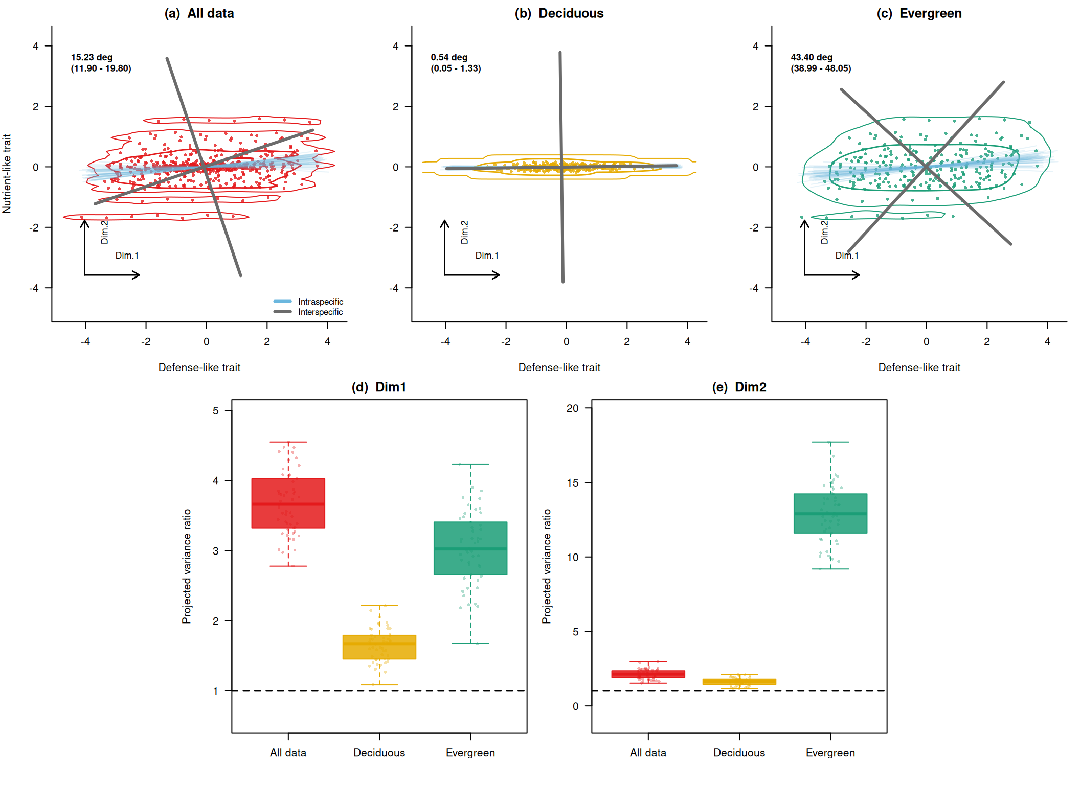
First, check the distributions of angular differences and variance ratios numerically. angles expresses how much the axis rotated from the interspecific axis. eig_ratio_dim1 and eig_ratio_dim2 express how much the variance along the first and second interspecific axes increased when intraspecific variation was included.
# Rotation angles of the principal axis.
summary(res_all$angles)
Min. 1st Qu. Median Mean 3rd Qu. Max.
11.13 13.44 14.81 15.23 16.89 21.29 summary(res_D$angles) Min. 1st Qu. Median Mean 3rd Qu. Max.
0.03909 0.30727 0.50888 0.53914 0.69654 1.46247 summary(res_E$angles) Min. 1st Qu. Median Mean 3rd Qu. Max.
37.12 42.14 43.19 43.40 44.84 50.02 # Variance ratio along the first interspecific axis.
summary(res_all$eig_ratio_dim1) Min. 1st Qu. Median Mean 3rd Qu. Max.
2.780 3.322 3.663 3.677 4.014 4.550 summary(res_D$eig_ratio_dim1) Min. 1st Qu. Median Mean 3rd Qu. Max.
1.087 1.465 1.668 1.659 1.792 2.217 summary(res_E$eig_ratio_dim1) Min. 1st Qu. Median Mean 3rd Qu. Max.
1.672 2.685 3.024 3.034 3.397 4.235 # Variance ratio along the second interspecific axis.
summary(res_all$eig_ratio_dim2) Min. 1st Qu. Median Mean 3rd Qu. Max.
1.522 1.915 2.143 2.127 2.359 2.964 summary(res_D$eig_ratio_dim2) Min. 1st Qu. Median Mean 3rd Qu. Max.
1.139 1.446 1.644 1.627 1.796 2.106 summary(res_E$eig_ratio_dim2) Min. 1st Qu. Median Mean 3rd Qu. Max.
9.193 11.629 12.901 12.860 14.168 17.720 Plot the Results from the Self-Made Data
Finally, I combine the shift between the interspecific axis and axes including intraspecific variation, plus variance ratios along the interspecific axes, into one figure. This is a self-made figure for understanding the point raised by Zhou et al. (2025), not a reproduction of a figure from the original paper. The panels compare all data, the deciduous-like group, and the evergreen-like group.
# Colors used across the figure.
# all, D, and E are used for points and contours.
# intra and inter are used for principal axes.
cols <- c(
  all = "#e41a1c",
  D = "#e6ab02",
  E = "#1b9e77",
  intra = "#6bb7de",
  inter = "#6b6b6b"
)

# Draw a line in the direction of the specified eigenvector from the result of
# principal_axis().
# dim = 1 draws the first axis, and dim = 2 draws the second axis.
draw_axis <- function(pa, dim = 1, len = 2, col = "black", lwd = 3, lty = 1) {
  # Place the line center at the center of the data points.
  c0 <- pa$center

  # The eigenvector is a direction vector of length 1.
  # Multiplying by len makes the line long enough to see in the plot.
  v <- pa$vectors[, dim]

  segments(
    x0 = c0[1] - len * v[1],
    y0 = c0[2] - len * v[2],
    x1 = c0[1] + len * v[1],
    y1 = c0[2] + len * v[2],
    col = col,
    lwd = lwd,
    lty = lty
  )
}

# Show where scatter-plot points are concentrated with contour lines.
# MASS::kde2d() estimates a two-dimensional kernel density, and contours are
# overlaid on the scatter plot.
draw_density <- function(x, y, col, xlim, ylim) {
  # Do not stop the main calculations if MASS is unavailable.
  if (!requireNamespace("MASS", quietly = TRUE)) {
    return(invisible(NULL))
  }

  # Specify lims so the three trait panels use density estimates for the same
  # coordinate range.
  dens <- MASS::kde2d(x, y, n = 80, lims = c(xlim, ylim))
  z <- as.vector(dens$z)
  z <- z[z > 0]

  # Draw only the high-density areas as contour lines.
  # These are auxiliary lines showing the main concentration of points.
  contour(
    dens,
    add = TRUE,
    levels = quantile(z, probs = c(0.75, 0.9), names = FALSE),
    drawlabels = FALSE,
    col = col,
    lwd = c(1, 1.4)
  )
}

# Draw small arrows for Dim.1 and Dim.2 in the lower-left corner of each trait
# panel.
# These are schematic arrows that help readers read the figure, not estimated
# axes.
draw_dim_arrows <- function(xlim, ylim) {
  # Decide the start position and length from the panel coordinate range.
  x0 <- xlim[1] + 0.08 * diff(xlim)
  y0 <- ylim[1] + 0.13 * diff(ylim)
  x1 <- x0 + 0.20 * diff(xlim)
  y1 <- y0 + 0.20 * diff(ylim)

  arrows(x0, y0, x1, y0, length = 0.08, lwd = 1.4)
  arrows(x0, y0, x0, y1, length = 0.08, lwd = 1.4)
  text(x1, y0 + 0.06 * diff(ylim), "Dim.1", cex = 0.85, adj = c(1, 0))
  text(x0 + 0.06 * diff(xlim), y1, "Dim.2", cex = 0.85, srt = 90, adj = c(1, 1))
}

# Format the distribution of angles from resampling as a label for the figure.
# Here, the 2.5% and 97.5% quantiles are shown as a simple range.
angle_label <- function(angles) {
  ci <- quantile(angles, probs = c(0.025, 0.975), names = FALSE)

  sprintf(
    "%.2f deg\n(%.2f - %.2f)",
    mean(angles),
    ci[1],
    ci[2]
  )
}

# Draw one upper-row trait-space panel.
# Points, density contours, intraspecific axes, interspecific axes, and the
# angle label are drawn together.
plot_trait_panel <- function(
  dat_group,
  res,
  main,
  panel,
  col,
  xlim,
  ylim,
  show_y_label = FALSE,
  show_legend = FALSE
) {
  # First draw the scatter plot of individual values.
  # asp = 1 makes one unit on the x-axis the same length as one unit on the
  # y-axis.
  plot(
    dat_group$x,
    dat_group$y,
    pch = 16,
    cex = 0.65,
    col = adjustcolor(col, alpha.f = 0.8),
    xlim = xlim,
    ylim = ylim,
    asp = 1,
    xlab = "Defense-like trait",
    ylab = if (show_y_label) "Nutrient-like trait" else "",
    main = paste0("(", panel, ")  ", main),
    bty = "l",
    las = 1
  )

  # Overlay contour lines showing where the points are concentrated.
  draw_density(
    dat_group$x,
    dat_group$y,
    col = col,
    xlim = xlim,
    ylim = ylim
  )

  # Length of the principal-axis lines.
  # Using a value relative to the coordinate range keeps the appearance
  # consistent across panels.
  axis_len <- 0.42 * min(diff(xlim), diff(ylim))

  # Overlay the first intraspecific axis estimated in each resampling iteration
  # in pale blue.
  # Showing 50 lines makes the direction of axes including intraspecific
  # variation visible.
  for (pa in res$axes) {
    draw_axis(
      pa,
      dim = 1,
      len = axis_len,
      col = adjustcolor(cols["intra"], alpha.f = 0.16),
      lwd = 1
    )
  }

  # Draw the interspecific axis from species representative values as thick
  # gray lines.
  # dim = 1 is the comparison target for the rotation angle, and dim = 2 is the
  # orthogonal axis.
  # The difference between the pale-blue first axes and the gray first axis is
  # the intuitive meaning of the rotation angle.
  draw_axis(res$pa_inter, dim = 1, len = axis_len, col = cols["inter"], lwd = 3)
  draw_axis(res$pa_inter, dim = 2, len = axis_len, col = cols["inter"], lwd = 3)

  # Draw auxiliary Dim.1 / Dim.2 arrows in the lower-left corner.
  draw_dim_arrows(xlim, ylim)

  # Display the mean angle and range in the upper-left corner.
  text(
    xlim[1] + 0.03 * diff(xlim),
    ylim[2] - 0.06 * diff(ylim),
    angle_label(res$angles),
    adj = c(0, 1),
    cex = 0.85,
    font = 2
  )

  # Show the legend only in the first panel.
  if (show_legend) {
    legend(
      "bottomright",
      legend = c("Intraspecific", "Interspecific"),
      col = c(cols["intra"], cols["inter"]),
      lwd = c(3, 3),
      bty = "n",
      cex = 0.8
    )
  }
}

# Draw one lower-row boxplot panel for variance ratios.
# values is a list of three numeric vectors: All data, Deciduous, and
# Evergreen.
plot_ratio_panel <- function(values, panel, main, colors, ylim = NULL) {
  # If the y-axis range is not specified, automatically choose a range that
  # includes both the data and the reference line at 1.
  if (is.null(ylim)) {
    ylim <- range(c(unlist(values), 1))
    ylim <- ylim + c(-0.12, 0.12) * diff(ylim)
  }

  # Compare the distribution of variance ratios among groups with boxplots.
  boxplot(
    values,
    names = c("All data", "Deciduous", "Evergreen"),
    col = adjustcolor(colors, alpha.f = 0.85),
    border = colors,
    outline = FALSE,
    ylim = ylim,
    ylab = "Projected variance ratio",
    main = paste0("(", panel, ")  ", main),
    las = 1
  )

  # Overlay individual resampling results on the boxplots.
  # Slight horizontal jitter makes the amount of variation easier to see.
  for (i in seq_along(values)) {
    stripchart(
      values[[i]],
      at = i,
      vertical = TRUE,
      method = "jitter",
      jitter = 0.12,
      pch = 16,
      cex = 0.6,
      col = adjustcolor(colors[i], alpha.f = 0.35),
      add = TRUE
    )
  }

  # ratio = 1 is the reference line for the variance from species
  # representative values only.
  # Values above 1 indicate increased variation along that interspecific-axis
  # direction.
  abline(h = 1, lty = 2, lwd = 1.4)
}

# Colors corresponding to the three groups in the lower row.
plot_cols <- c(cols["all"], cols["D"], cols["E"])

# Create a common xlim and ylim for the three upper panels from the range of all
# data.
lim <- range(c(dat$x, dat$y))
lim <- lim + c(-0.08, 0.08) * diff(lim)

# Save the current plotting settings so they can be restored at the end.
old_par <- par(no.readonly = TRUE)

# Use layout() to create a five-panel arrangement.
# The upper row has three panels, and the lower row has two centered panels.
layout(
  matrix(
    c(1, 1, 2, 2, 3, 3, 0, 4, 4, 5, 5, 0),
    nrow = 2,
    byrow = TRUE
  ),
  heights = c(1, 1.1)
)

# Make margins slightly smaller so the multiple panels read as one figure.
par(mar = c(4, 4, 2, 1), oma = c(0, 0, 0, 0))

# Upper row: three panels showing rotation in trait space.
plot_trait_panel(
  dat,
  res_all,
  "All data",
  "a",
  cols["all"],
  lim,
  lim,
  TRUE,
  TRUE
)
plot_trait_panel(
  subset(dat, group == "D"),
  res_D,
  "Deciduous",
  "b",
  cols["D"],
  lim,
  lim
)
plot_trait_panel(
  subset(dat, group == "E"),
  res_E,
  "Evergreen",
  "c",
  cols["E"],
  lim,
  lim
)

# Lower left: variance ratio along the first interspecific axis.
plot_ratio_panel(
  list(res_all$eig_ratio_dim1, res_D$eig_ratio_dim1, res_E$eig_ratio_dim1),
  "d",
  "Dim1",
  plot_cols
)

# Lower right: variance ratio along the second interspecific axis.
plot_ratio_panel(
  list(res_all$eig_ratio_dim2, res_D$eig_ratio_dim2, res_E$eig_ratio_dim2),
  "e",
  "Dim2",
  plot_cols
)
# Restore the plotting settings.
par(old_par)
References
Warton, David I., Ian J. Wright, Daniel S. Falster, and Mark Westoby. 2006. “Bivariate Line-Fitting Methods for Allometry.” Biological Reviews 81 (2): 259–91. https://doi.org/10.1017/S1464793106007007.
Zhou, Guangkai, Daniel F. Petticord, Xingchang Wang, et al. 2025. “Intraspecific Variation in the Growth–Defense Trade-Off Among Deciduous and Evergreen Broadleaf Woody Plants.” New Phytologist, ahead of print, November 23. https://doi.org/10.1111/nph.70781.